Automatic Adaptive Images in Angular Applications
• • 7 min readIn this posts series different tasks are described that can be automated to perform a deployment of frontend applications in Angular.
Posts Series
- Build & Deploy Angular Apps en GitHub Pages con GitHub
Actions - Automatic Adaptive Images in Angular Applications
Introduction
Today, the users access to the Web apps through a wide variety of devices, such as laptops, tablets, smartPhones, desktop computers, etc..., which have different screen sizes and resolutions. On the other hand, one of the principles of accessibility is to get as many users as possible enriching and satisfying the experience in accessing applications overcoming both physical barriers (hearing, visual disabilities, cognitive, etc ...) as well as material or technological. Today, there are users who connect from different devices, as we have already indicated, and also with different technological features such as the bandwidth of internet network.
In addition, there are web applications that have high visual content, and therefore, a lot of images. These images are normally stored on a CDN (Content-Delivery-Network) from which the images are downloaded to the device.
In some specific areas of the world, or circumstances, downloading all these images can mean a bandwidth that is excessive for the users. Similarly, any optimization, even to users who have high performance devices is a benefit since the app will be available sooner.
In this post, we are going to show step by step how to build an Angular application with responsive images for different sizes although it could be for any technology.
Problem to solve
The problem I have solved is the one I have experienced for the open source project Angular-Communities. This project consists of a Google Map in which the shields of the different Angular communities around the world are displayed. Also, on a side-nav we find all the shields of the different communities, so we can navigate and select them for advanced information on those Angular communities. Allow me to tell you, just as an aside, do not hesitate and add your community to this map so that we can all have the information of your community.
In this specific problem, we had,at the date of this post, about 70 communities, each with its personalized shield. Each of these shields is an scalar image in PNG format that can be between 13KiB – 186KiB. The 70 images have a size of 2.6MiB. In this situation, we need to download all the images at the beginning, not being able to perform a technique lazy to download the images. This simplifies the code and the development complexity drastically. However, it seems worrying that all devices, no matter their sizes, have to download 2.6MiB every time that access the website, causing an unnecessary loss of performance.
For this post, I have built a small demo in which all the images from Angular-Communities are downloaded in a single component with the final result of the post.
The following table shows the size of the images according to the format and the image size. It can be seen that the format getting the smallest file size, even with the same image size, is .webp.
Create images of different sizes and formats
Imagine we had to edit each of the images with a software graphic editing, such as Gimp or Photoshop, manually. This would provoke a great amount of time invested just changing the size, quality and format of the images. We might think that doing this task only once for our task it could be a tedious but valid task (still I think that we should not do it manually, being able to do it automatically). However, this task gets more complicated if the images we want to carry out the process to gradually increases by interaction with the users or even if we have to make different adjustments to the sizes and qualities that we want to generate for each of the images.
Therefore, the ideal would be to have a tool/script that allows us to automate this task so that it is only a matter of executing a simple script and all our battery of images is generated automatically.
In our context, we are going to use a tool built using node.js since installing it and using it in our Angular application does not require the installation of new applications or package managers for different programming languages.
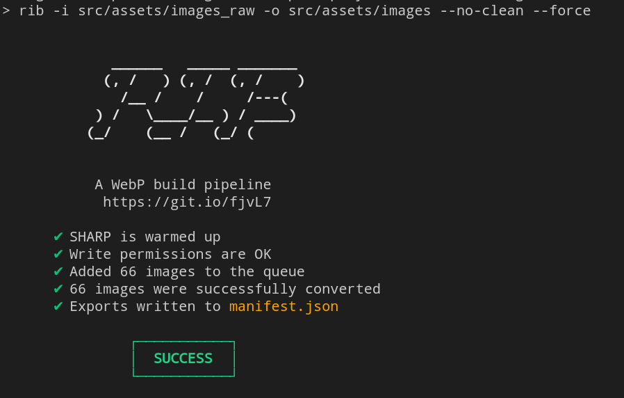
The chosen tool is responsive-image-builder (RIB), which is defined as a building pipeline of images in WebP format ultra fast for the Web. The time it will take to generate the images will depend on your processor or the processor of your integration system and the number of images to be transformed.
RIB Features
- ⚡ Fast - Uses the lightning-quick [libvips
- image processing](https://github.com/jcupitt/libvips/wiki/Speed-and-memory-use).
- 🔥 Multithreaded - Scales to all available CPU cores.
- 📦 Zero configuration - Change nothing, change everything. You choose.
- 🌍 Universal - a flexible image build process that doesn't enforce any principles.
- ✂️ Cross-platform - Tested on Windows, macOS and Linux.
- 😊 Friendly experience - telling you what's going on, from start to finish.
- ✨ SVG Tracing - for really fancy placeholders.
All these features make this open-source tool ideal for our purpose. First of all, we install the package as a development dependency.
npm i -D responsive-image-builder
The use of this tool is quite simple since we only have to specify the parameters of the following command:
rib -i <input> -o <output> <options>
Therefore, if we want to include in our deploy pipeline that all the images in a certain directory are transformed and generated in a new directory, we can build the following npm-script that runs just before the deploy task.
"pre:deploy": "rib -i src/assets/images_raw -o src/assets/images --no-clean --force"
Although one of the characteristics of this tool/package is that it does not need configuration, in our specific case we want to build a responsive application in which each screen size has a set of images adjusted to its parameters. In other words, when a user accesses the Web page from a mobile device, they must download images that are the appropriate size for that device, images that are lighter than the ones for large screens, and when accessed from a device with a large screen, laptop or smartTV high resolution images can be enjoyed.
Therefore, we must configure the different sizes of images that we want to automatically generate. This configuration is done by creating a file called .ribrc.json in which an array is specified with the different configurations or image generation formats that you want to generate from each of the original images. Thus, each of the configurations allows you to specify a suffix using the name property, the width of the image using the width property, and that you want to force the creation of the image (it is overwritten if a previous one already exists) with the force property.
Therefore, in our configuration file, we are specifying that we will generate five images from each of the original images that will have the configurations as prefixes: xs, sm, md, lg and xl.
Also, rib generates all images in the original format, .png or .jpg and in the .webp format. So if the browser supports the .webp format, it uses this one instead of the previous ones. The following section shows how you can delegate responsibility for using one image or another to the HTML (using the picture element).
Elemento Picture
HTML5 introduced the <picture> element which allows more flexibility to specify images compared to the <img> element. The most common use of the <picture> element is to delegate responsibility for images in adaptive layouts to the browser via HTML. In other words, instead of scaling large images using the CSS width property, the most appropriate image can be selected depending on the device that is accessing the web application.
The <picture> element consists of two tags: one or more <source> elements and an <img> element. The browser checks the first <source> element that satisfies the media query with the device that is accessing the web application, and the image specified in the srcset attribute will be displayed. The <img> element is used as the fallback option in case the media query of any <source> element is not satisfied.
In our Angular component, we define an array of configuration of the images to show in the template. In this array we define several properties:
- min/max: width viewport of the device that accesses the Web application.
- suffix: The image suffix.
- format: Format of the image, having the formats
.webpand.png.
In our template, we only need to go through the array defined above to generate the <source> and <img> elements to delegate responsibility to the template.
Result
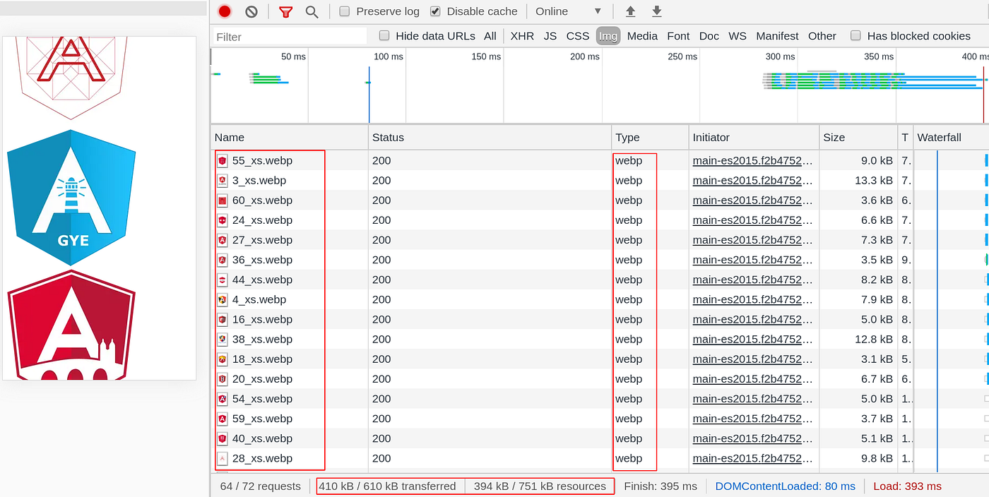
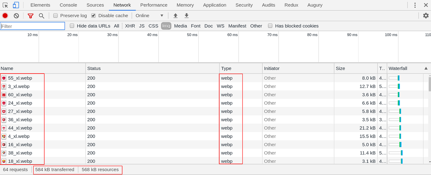
The result obtained after performing these simple steps is that we have a directory with the images in deploy with different sizes and formats to be used depending on the device that accesses the Web application. The following images show the result of our application, which downloads some images or others depending on the device that accesses the application. The images show the images that would be downloaded by a mobile device and a large screen device (large monitors or television). In this way, we are providing greater accessibility to our Web application since friendly access to a greater number of devices is being allowed.
Finally, if you want to test the entire built system we only have to use the deployment npm-script, which can be integrated in a task of our CI/CD system as it is in the original project Angular- Communities delegating the responsibility to carry out all this task to an automatic system.
Conclusion
In this post, we have been able to see how the performance and accessibility of a web application can be improved in an automated way, adapting the images according to the device that accesses the Web. In this way, users do not have to download images that are not suitable for their devices, allowing greater accessibility to the Web.
If we want to continue improving the performance of our Web applications, it is very easy to add a Service Worker that caches our static content, so that the device does not have to make requests for all the images every time it logs in. This feature is interesting if the images are not dynamic, that is, they will not undergo changes in each request of the end user.
In future posts related to this series of deployment of our frontend application, we will present how to integrate the tests automatically, allowing us to have a more complete workflow in our CI/CD system and adapted to our needs.